Manifest Pages

Thursday, September 15, 2011

Page Two–Under Surveillance

Now that I’ve got a page under my belt, I don’t want to waste the momentum.  So I’ve jumped straight into page two with a vengeance.  I had the idea that as the salesman (who has now been named by the way – Jim Randall – everyone calls him Randall) enters the Production facility, he is observed via security camera.  In this entryway I have placed a coat rack directly beneath the camera and a world map on the opposing wall.  There is the main glass door entrance from the outside on the left and a glass door entrance to the lobby on the right.  To create a sense of movement, I thought I would fracture the frame into a series of camera moves – the perspective of the area changes as the camera follows Jim from left to right.  The action is the entry through the left door (with a BUZZ as the door is remotely unlocked), removing his hat, removing his coat and finally stepping through into the lobby.  I thought I would also have an unseen receptionist welcome him over an intercom.
Here’s the first sketch:
Page 2 - First Sketch

I am making an attempt to show the extreme perspectives and slight ‘fish eye’ you would see from an overhead camera.  I then created a separate layer for the final frame template and filled it in:
V1 P2 - Frame

And have now begun the first ink on the middle section:
V1 P2 - Ink 1

Any thoughts?  Feedback?

Wednesday, September 14, 2011

Page 1 - Complete?

I'll look at it again in the morning, but I'm feeling pretty good to call page one done.  For the dialogue, I did as I said - short with the wife and pissed about the weather:
Page One - Final Rendering and Text
My handwriting sucks so in turn my lettering skills suck.  So a canned font I must choose.  I didn't want to go with a generic 'comic book' font... I've got a little more CLASS than that (bullshit).  So I went with a font called 'Iskoola Pota.'  I know nothing about the history of this font and for all I know it was developed to write Al Qaeda bomb-making manuals... I like how it looks - that's all.

For dialogue balloons I used a simple black rectangle for date/time/location stamps and classic white ovals without black outline.  Again, I just like how it looks.

I would appreciate any feedback you have.  All the pieces are saved as separate layers so changes can be tried/made with minimal effort.  Thanks for checking it out.

Thursday, September 8, 2011

A Page In Progress...

On a dreary and rainy day an economic mini car pulls up in front of an anonymous professional building. A man climbs out burdened with a tattered laptop bag. He mutters to himself as he walks into the building.

Above is the quick description and original plan for page one. For this simple opening scene I chose to give the majority of the page to the act of exiting the car. Two small frames contain the car pulling in and the walk into the building. The two small frames have rain falling to the left and the main section the rain falling right (I love the idea of creating a texture separation with the opposing rainfall).:
Page One Sketch
As I started inking, I was thinking about this character - the salesman. I love characters with a weakness. I prefer my heroes flawed. Originally, I was thinking his damage would be his gruff attitude built up after years on the sales road; hardened by the disappointment of an ever elusive chased dream. But the challenge I have set for myself with this project is to create situations and characters that inspire passion and lead to extreme and powerfully unforgettable moments. So... I need a source of pain in his life. What better source for current or potential pain than a loved one?
Page One First Ink

Page One - Cell Phone Addition
I decided it would be interesting to set the tone on page one with a farewell to the salesman's wife. I have yet to finalize the dialogue, but my intent is for it to be a bit short and cold - as if his years on the road have led to a tangible space between him and her. They are polite and keep in regular contact but live truly separate lives. This also leaves open the opportunity for the wife to be put in danger in a later issue and the relationship to be challenged with an extreme circumstance.

From here I have become slightly obsessed with rendering. I may have done myself a disservice by spending so much time and setting the tone for a high level of detail going forward. But at this point I don't feel I can compromise on technique. Here is the progress to date:
Page One - Ink Two
Page One - Ink Three
Page One - Ink To Date
As you can see, the main section is pretty much complete with the exception of the rain. The top needs the lot and car filled in, the building windows rendered and the rain added. Then once I complete the bottom frame I have the all important task of choosing dialogue balloon style and font. I hope to be at the point of having to make these decisions by the end of the weekend.

I know I'm only one unfinished page in, but I'd love any input anyone out there has.

Monday, September 5, 2011

Breaking The Golden Rule

"You don't make an album sleeve before you write the songs" 
                                                                            - Bill's Golden Rule

Maybe it's an extension of my personal damage but in my head the cover of any book cannot be made until the story is complete, the editors have given final approval and the publishers are ready to go to print.  The cover developers have read the book and have chosen a moment to capture (or a tone to set) based on the content within.  Making the cover too soon dooms the project to failure and curses your fingers to cramp whenever you pick up a pencil.

So the first thing I set out to do was to design the title text/logo and draw the cover.  I knew the moment I wanted to capture:

The evil lab tech has just spewed his manifesto to the shocked members of the office meeting and raced off into the production area.  He climbs up to the top of an open-topped mixing tank and dives in...

This is the climax of the first Volume and a picture I've had in my head from the start.  I decided to go with a traditional comic cover format - a spot for the title, a block for the comics code of ethics and room at the bottom for the title of the issue:

Cover Layout
Now the sketch.  I start with the tank in the foreground and the lab tech leaning over the edge - poised to dive in.  In the background, our salesman is pushing his way through a pair of double doors and shouting for him to stop.  I was thinking that a chemical lab like this would produce some nasty fumes so I wanted a giant exhaust fan as a focal point.  And to join the fan to the action I placed a mezzanine with assorted pieces of non-descript heavy equipment:

Cover Sketch
I wanted some eye popping color and decided my light source for the page would be the sun shining through the exhaust fan:
Sketch With Light Source
Before I got too far along with inking, I wanted to finalize the placement of the title frame:

Cover Sketch With Title Frame
For the record, there is no official business entity called "Persuading Comics."  Many moons ago I was in a shitty punk band who only wrote songs about drinking and being angry called Chemical Persuasion.  I've set this raw expression of whatever as my benchmark of creativity and have kept the 'Persuading' in all the stuff I do as a nod to myself that I'm "keeping it real" or some such bullshit.

Over the past few weeks I've done some more work to the cover and to spare you a detailed description of every iteration along the way -  have gotten here:
Cover First Ink

Cover First Airbrush

Volume One Cover To Date

I'm left with defining the mezzanine and equipment, the room itself and some detail and shading on the tank.  But I've spooked myself out of breaking the Golden Rule for now.  So I've started work on page one - which will be next discussed.


Sunday, September 4, 2011

Catching Up - Part One

I've done some comics in the past but nothing ever published or shared on the net.  Just passed around the circle of friends is all.  About a year ago my wife got me a digital drawing tablet (it was a Father's Day present if you must know) - nothing fancy - not a real Wacom or anything.  A budget model for a budget dude.  At the time I was a few months into my stupid web comic "This Little Piggy..." which was originally put together with Microsoft Paint but at that point I had graduated to Paint.net[http://paint.net/] (a great piece of software if you're looking for a simple upgrade from regular Paint).  The tablet was a real step change for Piggy's quality and I think it's pretty clear if you go back where the change happened.  Anyhoo, at the time I was having some financial difficulties and was actively whoring around Piggy hoping to pick up a few clicks (and a few bucks) and started to get actively involved on a couple of comics forums.  I won't list them now, but I received tons of feedback from the wonderful folks there and a lot of really good recommendations for formatting, resolution, style and software.  It was then I became aware of GIMP [http://www.gimp.org/the freeware equivalent of Photoshop - and the rest is history.  


There.  I'm done with the bio and the history lesson and the "who the hell does this guy think he is" stuff.  I'm nobody.  'Nuff said.


Here we are a few months later and I am haunted by what I think is a good kick off story for a comic series.  And I think it's good enough that I want to do it as close to professionally as I am capable.  So I do a little research (OK - I go to Wikipedia) and find out that since the mid-1970's comic books have been standardized to a page size of 6 ⅝" x 10 ¼" (17 x 26 cm).  Following these dimensions I make a quick page template and give it a 1/4" border:


I want the resolution to be fairly clean (in case it is ever to be printed or something) so I increase it to 1000x1529 pixels.  This makes my files much larger but the clarity of the line is worth every MB.

I quickly wrote out the story for the first "issue" and have a clear 'good guy' (the salesman) and 'bad guy' (the lab tech).  As I have sometimes had issues with consistency when drawing characters several times I know I need to do a character study - like those old Disney documentaries I've seen a hundred times.  First the 'good guy':

First Sketch

Ink Over Pencil

Ink And Airbrush

First Ink On Head Studies

Airbrush On Head Studies

Completed Study
I was trying to get this feel of gruff age - slightly disheveled but always dressed professionally no matter what type of horrific mutant he is battling at the time.

Next our evil lab tech.  I'll be honest and say that he is based on an actual person who shall remain unnamed (unless he wishes to name himself - at which point I will gladly confirm):

First Sketch

Ink Over Pencil

Ink And Airbrush

Final Ink And Airbrush
For posterity I've saved every iteration in multi-layer format (the sketch is one layer, the ink another, the airbrush yet another).  This is really meaningless in the big picture, but I'm excited enough about this that I want to revel in every nuance as though I will someday go back and do an epic re-mix of it from the master layers when I attain more skills or technology progresses to the point that there is a comic auto-tune or something I can use to clean it up a bit.

Tomorrow we'll discuss my breaking of the golden rule of comics and the beginnings of page one as our story unfolds.  

In Progress...

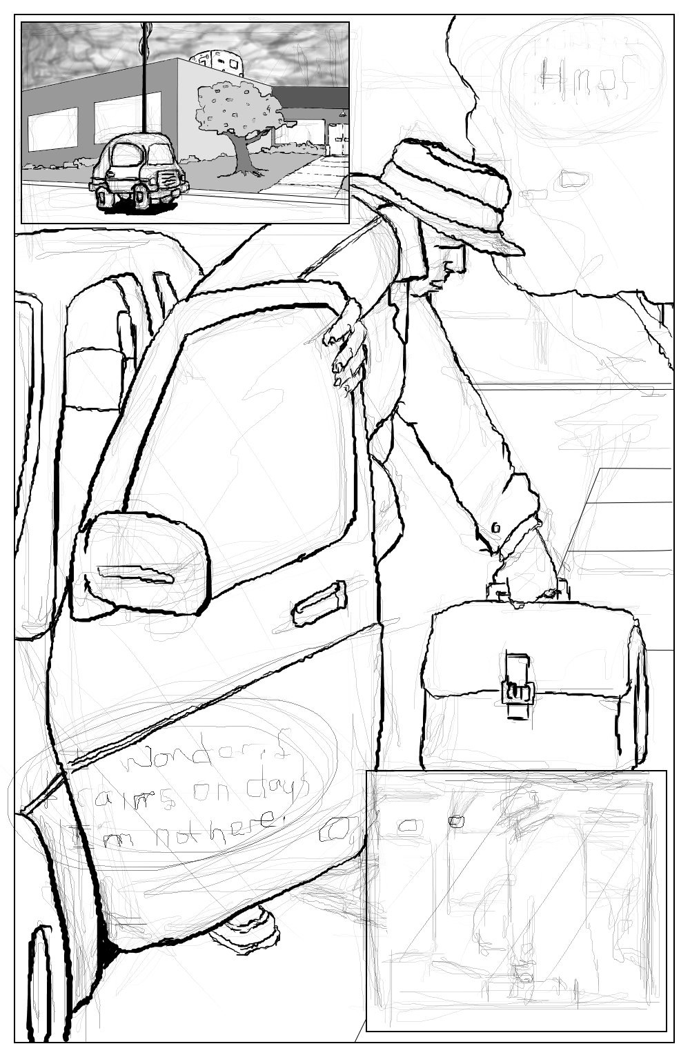
Volume One Cover - In Progress
So, hey... I've started working on a new (non-Piggy themed) comic.

I have been stuck with this sequence:

"An aging salesman calls a meeting with the Production and Development group of the cosmetics he shills.  There have been reports from his customers that they have seen shocking side effects (which are presented as photos in a Powerpoint presentation). During the meeting, one of the lab techs starts to get agitated and eventually jumps up and starts shouting his twisted manifesto. The lab tech races out of the room and dives into a tank of the latest batch of his evil concoction - and is transformed into...

Afterwards, the CEO or Chairman of the Board or something pulls aside the aging salesman and hands him a shipping manifest that he is to use to track down all of the tainted product before more mutations occur."


This is the basic outline of Volume One that is now in progress.  I thought it would be cool to present the process publicly and I have begun to do so on Facebook and Google Plus (much probably to the annoyance of my friends and family).  To take it a step further, I'll also post progress here - where ultimately the finished form will reside.

For the record, I'm a hack amateur with a regular day job no allusions of grandeur.  This will not be the greatest comic ever. It will be done in fleeting free moments when I'm not working on actual work work or This Little Piggy... or (gasp) spending time with my gorgeous (and endlessly patient) wife and three (sometimes aggravating but mostly wonderful) sons.  But I'll do my best to present thoughtful dialogue, frame things in a cool way and render things to the best of my ability.

And don't hesitate to tell me when I screw up, continuity is off, the story doesn't quite jibe or something just sucks.  I'm also open to your good ideas and will gladly steal the best ones.

Watch here for  character developments, early sketches, page layout frames and any other progress as we go.  I may put out early drafts of dialogue and revisions, story arcs and loose ideas.  Again feel free to criticize and provide advice or input.

I'll shut up now.  I just hope someone digs this.